
Array Object Table
Overview
Array Object Table is a table widget that renders an array of objects as a paginated, filterable table on the dashboard. Each object in the array becomes a row. Columns are configured manually, supporting multiple data types, editable cells, custom components, row actions, and export.
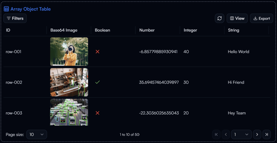
Array Object Table widget on the Dashboard
Widget Info
| Field | Value |
|---|---|
| Type | Table |
| Description | Paginated table for displaying arrays of objects |
| Data Types | array[object{*}], null, undefined |
| Dev Stage | Beta |
Data Source
The Data Source dropdown binds the widget to a flow variable. The variable must be an array of objects (array[object{*}]). Each object in the array becomes one row in the table.
Settings
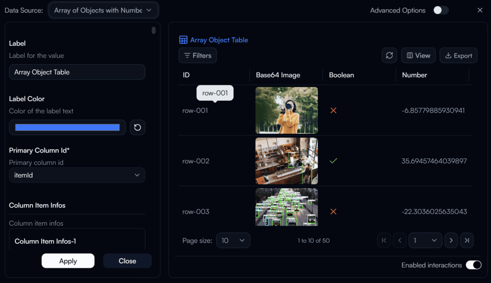
Array Object Table settings panel
Label
Label for the table.
Label Color
Color of the label text. Use the color swatch to pick a custom color, or press the reset button (↺) to restore the default.
Primary Column Id
requiredThe key in each object that uniquely identifies a row. Used as the primary key for row actions and editing. Supported column ID types are listed in the Column Item Infos section below.
Column Item Infos
Defines the columns to display in the table. Each entry corresponds to one column and includes the following sub-settings.
Column ID — The key in each object to read the value from. Supported types:
| Type | Description |
|---|---|
itemId | Row identifier |
boolean | Boolean value |
number | Number value |
integer | Integer value |
str | String value |
strTimestamp | Timestamp string |
strBase64Image | Base64-encoded image string |
strIcon | String rendered as an icon |
strBadge | String rendered as a badge |
arrayStr | Array of strings |
arrayStrBadge | Array of strings rendered as badges |
arrayIntBadge | Array of integers rendered as badges |
obj | Nested object |
Column data type — The data type of the column values (uses the same type list as Column ID).
Column label — The header text displayed for this column in the table.
Editable — When enabled, the cell uses an editable input component. If the column is the Primary Column, this is always overridden to false.
Filter type override — Overrides the default filter type for this column.
Component override — Overrides the default display component for this column.
Value options — Defines selectable value options for this column. Each option can have a Tailwind CSS class name applied for custom styling.
Column data item type — For array-type columns (arrayStr, arrayStrBadge, arrayIntBadge), specifies the type of each item in the array.
Row Action Config
Configures row-level actions shown on each table row.
Enable row edit — When enabled, each row displays an edit button that allows inline editing.
Enable row delete — When enabled, each row displays a delete button.
Custom Actions — Defines additional custom action buttons per row. Each custom action includes:
- Trigger ID — Unique identifier for the action, used to identify which action was triggered in the flow.
- Action label — The label displayed on the button.
- Icon ID — Optional icon to display on the button.
- Button variant — Visual style of the button (
default,outline,ghost,link,destructive). - Class Name — Tailwind CSS class name applied to the button for custom styling.
Advanced Options
Enable Advanced Options at the top right of the settings panel to reveal the following additional settings.
Label Class Name
Tailwind CSS class name applied to the label element for custom styling.
Label Icon ID
The icon to display next to the label.
Label Icon Class Name
Tailwind CSS class name applied to the label icon element for custom styling.
Layout
Display layout of the widget.
| Value | Description |
|---|---|
default | Label appears above the table (stacked vertically) |
row | Label and table appear side by side on the same row |