
Number Input
Overview
Number Input is an input widget that lets users type a numeric value directly into a text field on the dashboard. It supports min/max bounds, step increments, decimal precision, and optional prefix/suffix text such as units.
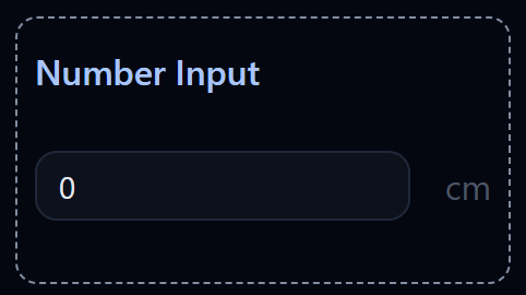
Number Input widget on the Dashboard
Widget Info
| Field | Value |
|---|---|
| Type | Input |
| Description | Input field for number values |
| Data Types | number, integer, bigint, null, undefined |
| Dev Stage | Beta |
Data Source
The Data Source dropdown binds the widget to a flow variable. The entered number is stored into this variable when the user confirms the input. The variable must be of a numeric type.
Settings
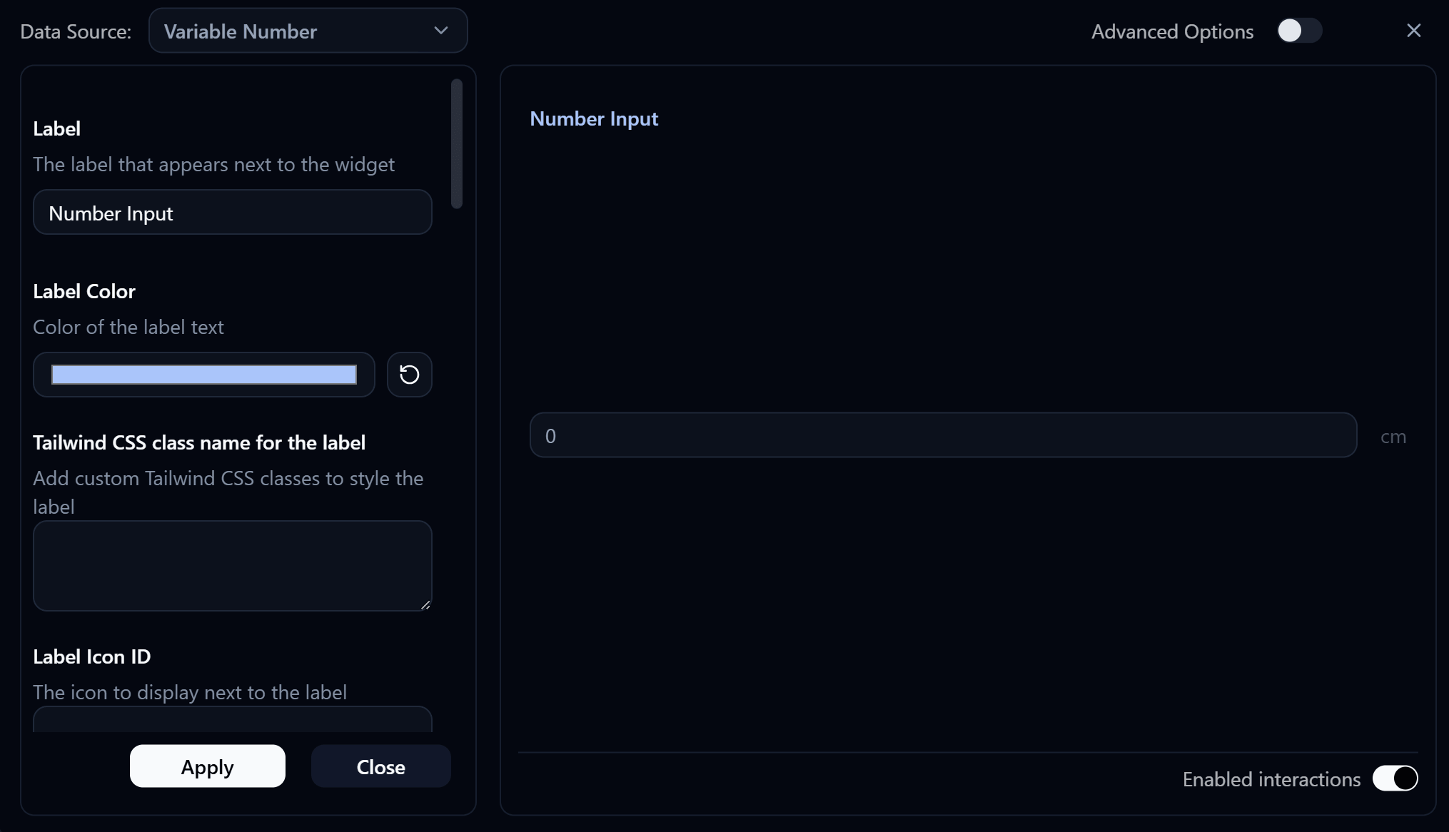
Number Input settings panel
Label
Label displayed on the widget.
Label Color
Color of the label text. Use the color swatch to pick a custom color, or press the reset button (↺) to restore the default.
Label Class Name
Add custom Tailwind CSS classes to style the label element.
Label Icon ID
The icon to display next to the label.
Label Icon Class Name
Add custom Tailwind CSS classes to style the label icon.
Layout
Choose the layout style for the widget.
| Value | Description |
|---|---|
default | Label appears above the input (stacked vertically) |
row | Label and input appear side by side on the same row |
Override Value
Override the widget's value to display custom data instead of the bound variable's actual value.
Value Class Name
Add custom Tailwind CSS classes to style the value display.
Placeholder
Text displayed when the input is empty.
Min
The minimum allowed value. Values below this are rejected.
Max
The maximum allowed value. Values above this are rejected.
Step
The increment/decrement amount when using the up/down controls on the input field.
Read Only
When enabled, prevents the user from editing the value.
Decimal Places
Number of decimal places allowed in the input. For example, 2 allows values like 3.14.
Prefix
Text displayed before the value (e.g. $, kg). Add custom Tailwind CSS classes via Prefix Class Name to style it.
Suffix
Text displayed after the value (e.g. %, °C, cm). Add custom Tailwind CSS classes via Suffix Class Name to style it.