
Number Slider
Overview
Number Slider is an input widget that lets users select a numeric value by dragging a slider handle on the dashboard. It supports gradient track coloring, step marks, and inverted mode, making it suitable for visualizing ranges like percentages, thresholds, or intensities.
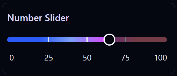
Number Slider widget on the Dashboard
Widget Info
| Field | Value |
|---|---|
| Type | Input |
| Description | Slider input for number values |
| Data Types | number, integer, bigint, null, undefined |
| Dev Stage | Beta |
Data Source
The Data Source dropdown binds the widget to a flow variable. The selected number is stored into this variable each time the user moves the slider. The variable must be of a numeric type.
Settings
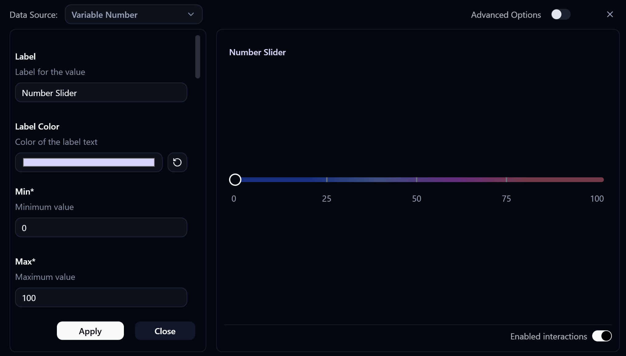
Number Slider settings panel
Label
Label displayed on the widget.
Label Color
Color of the label text. Use the color swatch to pick a custom color, or press the reset button (↺) to restore the default.
Min
requiredMinimum value of the slider range. Defaults to 0.
Max
requiredMaximum value of the slider range. Defaults to 100.
Multiple of Value
Step increment — the slider snaps to multiples of this value. For example, a value of 5 allows selecting 0, 5, 10, etc.
Read Only Mode
When enabled, the slider is displayed but cannot be moved by the user.
Show Step Lines
Displays tick lines along the slider track at each step interval.
Show Step Marks
Displays numeric labels at each step interval below the slider track.
Show Min Max Marks
Displays labels at the minimum and maximum ends of the slider.
Show Popup Label
Displays a floating label above the slider handle showing the current value while dragging.
Inverted Mode
When enabled, the slider direction is reversed — dragging right decreases the value instead of increasing it.
Track Gradient Stops
Defines the color gradient applied to the slider track. Up to 4 gradient stops can be configured. Each stop has:
- Value Percent — the position of the color stop along the track (0–100%)
- Color — the color at that position
Track Opacity
Controls the opacity of the slider track.
| Value | Opacity |
|---|---|
0 | Fully transparent |
0.25 | 25% |
0.5 | 50% |
0.75 | 75% |
1 | Fully opaque |
Slider Class Name
Tailwind CSS class name applied to the slider element for custom styling.
Advanced Options
Enable Advanced Options at the top right of the settings panel to reveal the following additional settings.
Label Class Name
Tailwind CSS class name applied to the label element for custom styling.
Label Icon ID
The icon to display next to the label.
Label Icon Class Name
Tailwind CSS class name applied to the label icon element for custom styling.
Layout
Controls how the label and slider are arranged.
| Value | Description |
|---|---|
default | Label appears above the slider (stacked vertically) |
row | Label and slider appear side by side on the same row |