
XY Number Chart
Overview
XY Number Chart is a chart widget that plots data from an array of objects on an XY axis. It supports multiple data series, various chart types (area, bar), datetime or numeric x-axis, conditional filters, and tooltip customization. It is well suited for time-series graphs, comparison charts, and data exploration.
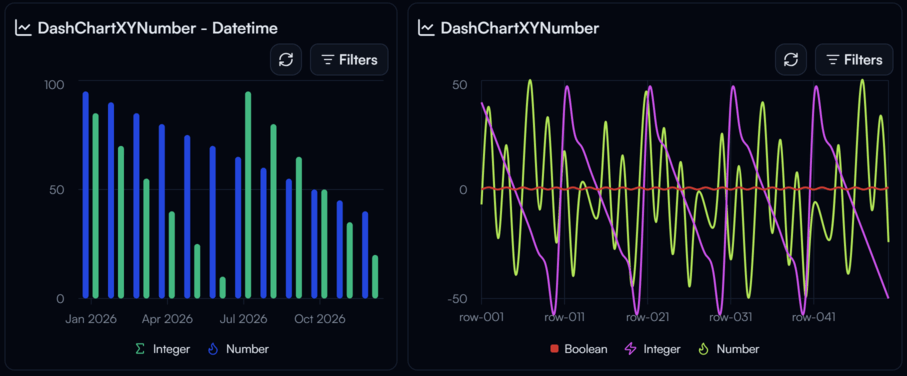
XY Number Chart widget on the Dashboard
Widget Info
| Field | Value |
|---|---|
| Type | Chart |
| Description | XY chart for plotting numeric data from arrays |
| Data Types | array |
| Dev Stage | Beta |
Data Source
The Data Source dropdown binds the widget to a flow variable. The variable must be an array of objects. Each object in the array represents one data point on the chart.
Settings
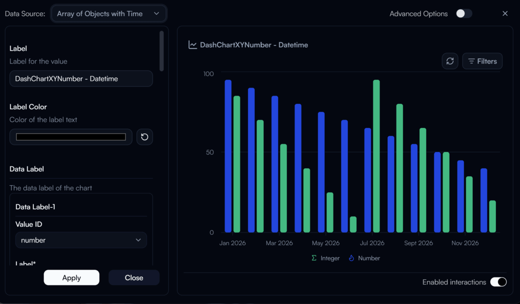
XY Number Chart settings panel
Label
Label for the chart.
Label Color
Color of the label text. Use the color swatch to pick a custom color, or press the reset button (↺) to restore the default.
Data Label
Defines the data series to plot on the chart. Each Data Label entry represents one series and specifies which key in the array objects to use as the Y value. Supported value types are datetime, string, number, integer, and boolean.
X Axis Key
requiredThe key in each array object to use as the X axis value. Supported types are datetime, string, number, integer, and boolean.
X Axis Is Datetime
When enabled, treats the X axis key as a datetime value and formats the axis accordingly.
Tick Format Mode
Controls the date/time format used for X axis tick labels when the axis is datetime.
| Value | Description |
|---|---|
Date Time | Full date and time |
Year | Year only |
Month | Month and year |
Day | Day, month, and year |
Hour | Hour and date |
Minute | Minute and hour |
Second | Second, minute, and hour |
None | No tick labels |
Chart Type
The visual style of the chart.
| Value | Description |
|---|---|
Area Natural | Smooth area chart with natural curve |
Area Linear | Area chart with straight line segments |
Area Step | Area chart with stepped lines |
Bar Vertical | Vertical bar chart |
Fill Mode
Controls how the area beneath each series line is filled.
| Value | Description |
|---|---|
default | Default fill behavior |
gradient | Gradient fill fading to transparent |
opaque | Solid opaque fill |
solid | Solid fill |
none | No fill |
Stacked
When enabled, stacks multiple series on top of each other instead of overlapping.
Show X Axis
When enabled, displays the X axis on the chart.
Show Y Axis
When enabled, displays the Y axis on the chart.
Show Filters
When enabled, displays the filter settings button on the chart header.
Min Significant Digits
Minimum number of significant digits to display in the tooltip value.
Tooltip Prefix
Text prefix shown before values in the tooltip label.
Consistent X Intervals
When enabled, makes the X axis intervals evenly spaced. Only applies when the X axis key is of type number, date, or datetime.
Advanced Options
Enable Advanced Options at the top right of the settings panel to reveal the following additional settings.
Label Class Name
Tailwind CSS class name applied to the label element for custom styling.
Label Icon ID
The icon to display next to the label.
Label Icon Class Name
Tailwind CSS class name applied to the label icon element for custom styling.
Layout
Display layout of the widget.
| Value | Description |
|---|---|
default | Label appears above the chart (stacked vertically) |
row | Label and chart appear side by side on the same row |