
Round Number Gauge
Overview
Round Number Gauge is a display widget that renders a numeric value as a circular arc gauge on the dashboard. It is ideal for visualizing metrics with a defined range such as percentages, sensor readings, or performance scores. The gauge supports gradient color stops, icons, and labels.
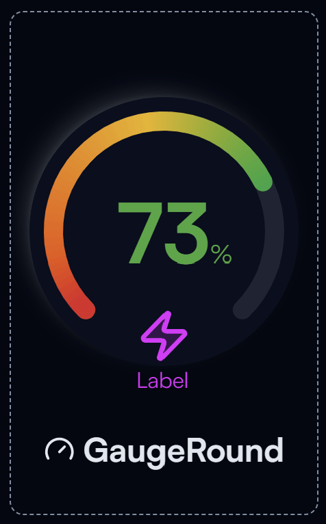
Round Number Gauge widget on the Dashboard
Widget Info
| Field | Value |
|---|---|
| Type | Display |
| Description | Circular arc gauge for displaying number values |
| Data Types | number, integer, bigint, null, undefined |
| Dev Stage | Beta |
Data Source
The Data Source dropdown binds the widget to a flow variable. The numeric value from that variable is displayed on the gauge arc. The variable must be of a numeric type.
Settings
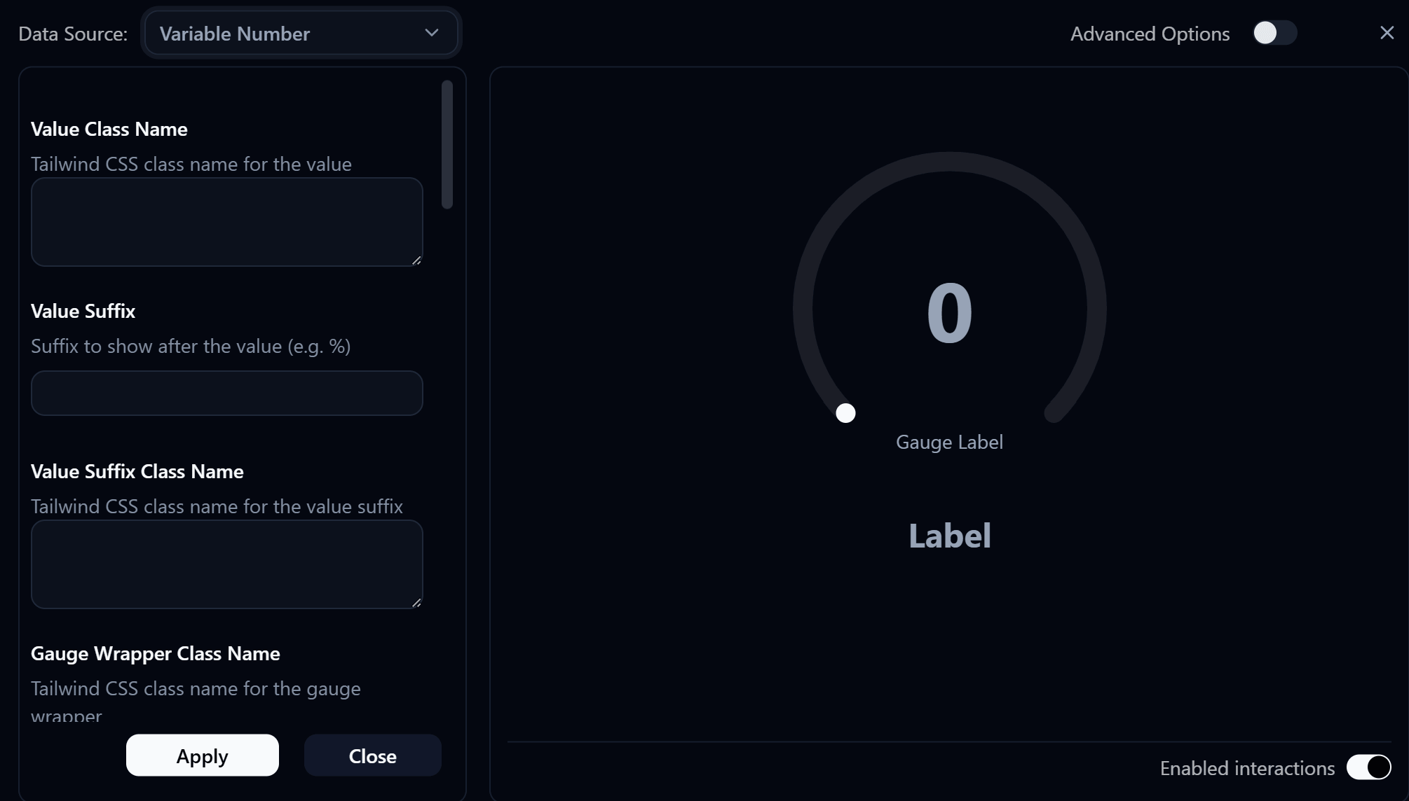
Round Number Gauge settings panel
Value Class Name
Tailwind CSS class name applied to the value text element for custom styling.
Value Suffix
Text shown after the numeric value, for example % or °C.
Value Suffix Class Name
Tailwind CSS class name applied to the value suffix element for custom styling.
Gauge Wrapper Class Name
Tailwind CSS class name applied to the outer gauge wrapper element for custom styling.
Label
Main label displayed below the gauge. Use this for a title or description of what the gauge represents.
Label Class Name
Tailwind CSS class name applied to the label element for custom styling.
Label Icon ID
The icon to display next to the label.
Label Icon Class Name
Tailwind CSS class name applied to the label icon element for custom styling.
Gauge Label
Secondary label displayed below the gauge value (inside the gauge area).
Gauge Label Class Name
Tailwind CSS class name applied to the gauge label element for custom styling.
Gauge Label Icon ID
The icon to display next to the gauge label.
Gauge Label Icon Class Name
Tailwind CSS class name applied to the gauge label icon element for custom styling.
Min
Minimum value of the gauge scale. The arc starts at this value.
Max
Maximum value of the gauge scale. The arc ends at this value.
Line Cap
Style of the gauge arc line ends (e.g., round or flat).
Line Width
Thickness of the gauge arc in pixels.
| Value | Description |
|---|---|
10 | Thin line |
15 | Slightly thin |
20 | Medium line |
25 | Slightly thick |
30 | Thick line |
Shadow
When enabled, applies a glow/shadow effect to the gauge arc.
Gradient Stops
Defines the color gradient along the gauge arc. Each stop specifies a position and color, allowing the gauge to transition through multiple colors as the value increases.