
Dialog Trigger
Overview
Dialog Trigger is a trigger widget that opens a modal dialog when the user clicks the button on the dashboard. The dialog supports markdown content, a configurable heading, and footer buttons that fire trigger signals into the flow. The dialog can also open automatically based on incoming value changes from the bound variable.
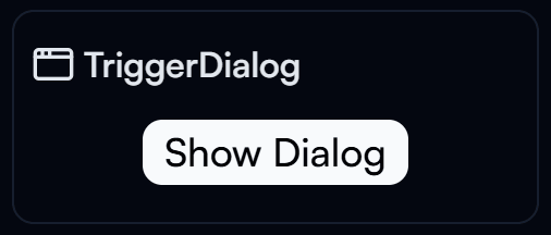
Dialog Trigger widget on the Dashboard
Widget Info
| Field | Value |
|---|---|
| Type | Trigger |
| Description | Opens a dialog with markdown content and configurable trigger buttons |
| Data Types | number, integer, bigint, string, null, undefined, boolean |
| Dev Stage | Beta |
Data Source
The Data Source dropdown binds the widget to a flow variable. The value controls whether the dialog opens automatically. A Visible preview toggle is available in the settings header to preview the dialog open state.
Settings
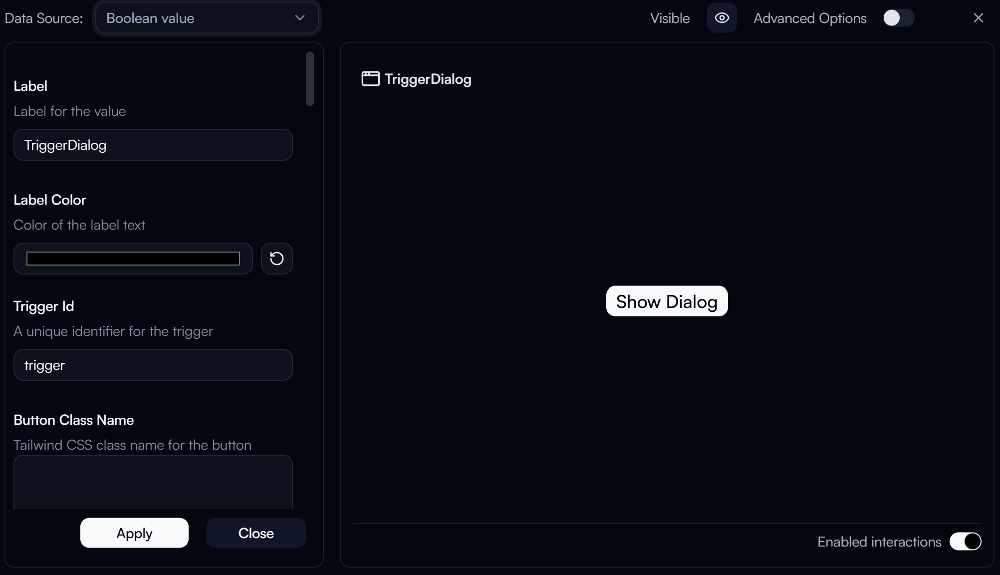
Dialog Trigger settings panel
Label
Label displayed above the widget.
Label Color
Color of the label text. Use the color swatch to pick a custom color, or press the reset button (↺) to restore the default.
Trigger Id
requiredA unique identifier for this trigger. The flow uses this ID to identify when the trigger button was clicked.
Button Class Name
Tailwind CSS class name applied to the trigger button for custom styling.
Button Label
The text label displayed on the trigger button that opens the dialog.
Button Label Class Name
Tailwind CSS class name applied to the trigger button label text.
Button Variant
Visual style of the trigger button.
| Value | Description |
|---|---|
default | Default button style |
success | Green success style |
destructive | Red destructive style |
outline | Outlined button |
secondary | Secondary style |
ghost | Ghost (transparent) style |
link | Link-like style |
Button Icon ID
The icon to display inside the trigger button.
Button Icon Class Name
Tailwind CSS class name applied to the trigger button icon for custom styling.
Dialog Buttons
Configures the footer buttons rendered inside the dialog. Each button fires a trigger signal when clicked.
Each Dialog Button entry includes:
- Trigger Id — Unique trigger identifier fired when this button is clicked.
- Value — Optional value forwarded with the trigger payload.
- Label — Visible text rendered inside the button.
- Class Name — Tailwind CSS classes applied to the button.
- Icon ID — Icon shown before the label.
- Icon Class Name — Tailwind CSS classes applied to the icon.
- Variant Override — Overrides the default button variant (
default,success,destructive,outline,secondary,ghost,link).
Auto Open
Automatically opens or closes the dialog based on incoming value changes from the bound variable.
| Option | Description |
|---|---|
| Open whenever the value changes | Dialog opens each time the bound variable value changes |
| Open when the value is non-zero (or truthy) | Dialog opens when the value is truthy |
Dialog Heading
Heading text displayed at the top of the dialog.
Dialog Content
Markdown content displayed inside the dialog body.
Advanced Options
Enable Advanced Options at the top right of the settings panel to reveal the following additional settings.
Label Class Name
Tailwind CSS class name applied to the label element for custom styling.
Label Icon ID
The icon to display next to the label.
Label Icon Class Name
Tailwind CSS class name applied to the label icon element for custom styling.
Layout
Display layout of the widget.
| Value | Description |
|---|---|
default | Label appears above the button (stacked vertically) |
row | Label and button appear side by side on the same row |