
Datetime Picker
Overview
Datetime Picker is an input widget that lets users select a date and time from a date-time input field on the dashboard. The selected value is written to the bound flow variable as an ISO 8601 datetime string.
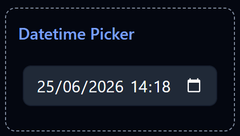
Datetime Picker widget on the Dashboard
Widget Info
| Field | Value |
|---|---|
| Type | Input |
| Description | Input field for datetime values |
| Data Types | string, null, undefined |
| Dev Stage | Beta |
Data Source
The Data Source dropdown binds the widget to a flow variable. The selected datetime is stored into this variable each time the user changes the value. The variable must be of type string.
Settings
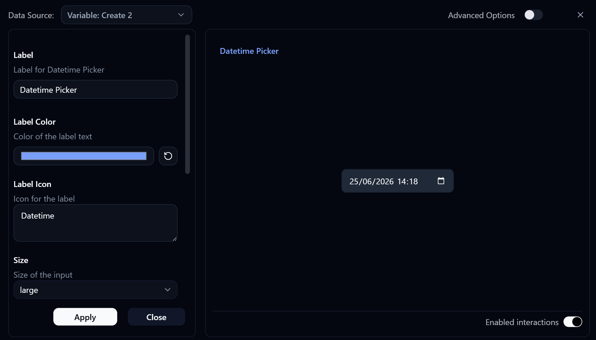
Datetime Picker settings panel
Label
Label displayed on the widget.
Label Color
Color of the label text. Use the color swatch to pick a custom color, or press the reset button (↺) to restore the default.
Label Icon
An icon displayed alongside the label. Enter the icon name to use (e.g. Datetime).
Size
Controls the size of the datetime input field.
| Value | Description |
|---|---|
small | Compact input |
medium | Standard input |
large | Larger input |
Read Only
When enabled, the datetime input is displayed but cannot be changed by the user.
Variant
Controls the visual style of the input field.
| Value | Description |
|---|---|
default | Standard filled input style |
outlined | Input with an outlined border style |
Date Format
Controls the display format of the date portion.
| Value | Example |
|---|---|
MM-DD-YYYY | 06-25-2026 |
YYYY-MM-DD | 2026-06-25 |
DD-MM-YYYY | 25-06-2026 |
Default Datetime Value
The initial datetime value pre-filled when the dashboard loads.
Advanced Options
Enable Advanced Options at the top right of the settings panel to reveal the following additional settings.
Label Class Name
Tailwind CSS class name applied to the label element for custom styling.
Label Icon Class Name
Tailwind CSS class name applied to the label icon element for custom styling.
Layout
Controls how the label and input are arranged.
| Value | Description |
|---|---|
default | Label appears above the input (stacked vertically) |
row | Label and input appear side by side on the same row |