
Image Frame
Overview
Image Frame is a display widget that renders an image from a flow variable on the dashboard. The image data is provided as a Base64-encoded string, making it suitable for displaying live camera frames, vision model outputs, or any dynamically generated image. The widget supports download, custom fit mode, and aspect ratio control.
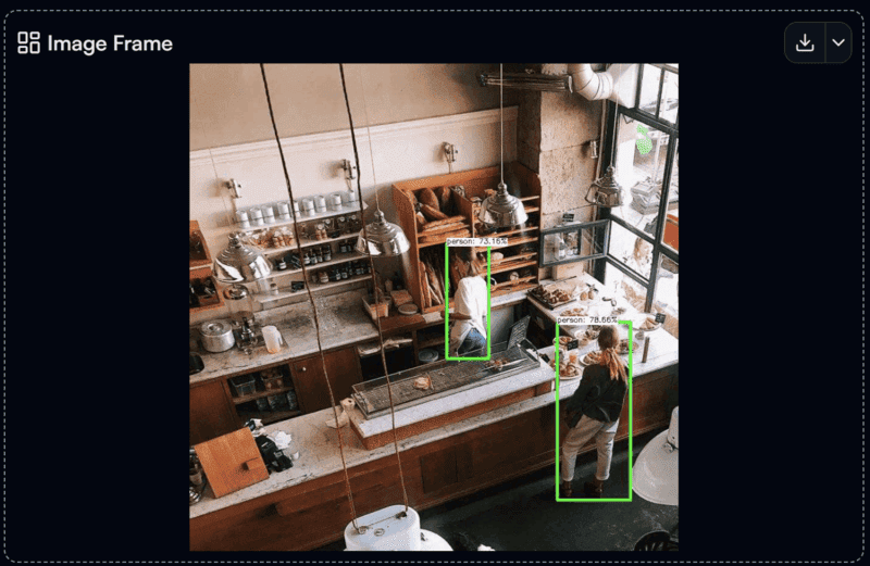
Image Frame widget on the Dashboard
Widget Info
| Field | Value |
|---|---|
| Type | Display |
| Description | Display an image from base64 or upload override |
| Data Types | string_base64image, null, undefined |
| Dev Stage | Beta |
Data Source
The Data Source dropdown binds the widget to a flow variable. The variable must contain a Base64-encoded image string (string_base64image).
Settings
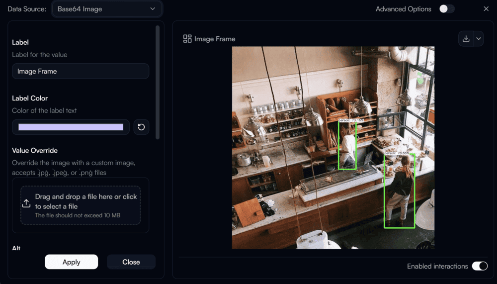
Image Frame settings panel
Label
Label for the displayed image.
Label Color
Color of the label text. Use the color swatch to pick a custom color, or press the reset button (↺) to restore the default.
Value Override
Override the displayed image with a custom static image file. Accepts .jpg, .jpeg, or .png files up to 10 MB. Drag and drop a file or click to browse.
Alt
Alt text for the image, used for accessibility.
Aspect Ratio
Sets the aspect ratio of the image frame.
Object Fit
Controls how the image is scaled within the frame area.
| Value | Description |
|---|---|
cover | Scales the image to fill the frame, cropping if necessary |
contain | Scales the image to fit within the frame, preserving aspect ratio |
fill | Stretches the image to exactly fill the frame |
scale-down | Scales the image down only if it is larger than the frame |
none | Displays the image at its original size |
Image Class Name
Tailwind CSS class name applied to the image element for custom styling.
Advanced Options
Enable Advanced Options at the top right of the settings panel to reveal the following additional settings.
Label Class Name
Tailwind CSS class name applied to the label element for custom styling.
Label Icon ID
The icon to display next to the label.
Label Icon Class Name
Tailwind CSS class name applied to the label icon element for custom styling.
Layout
Display layout of the widget.
| Value | Description |
|---|---|
default | Label appears above the image (stacked vertically) |
row | Label and image appear side by side on the same row |