
Basic Display
Overview
Basic Display is a display widget that shows the current value of a flow variable as text on the dashboard. It supports multiple data types and can be customized with text size, alignment, suffix, and conditional formatting.
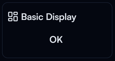
Basic Display widget on the Dashboard
Widget Info
| Field | Value |
|---|---|
| Type | Display |
| Description | A simple display widget for basic data types |
| Data Types | number, integer, bigint, string, null, undefined, boolean |
| Dev Stage | Beta |
Data Source
The Data Source dropdown binds the widget to a flow variable. The value from that variable is rendered as text on the dashboard.
Settings
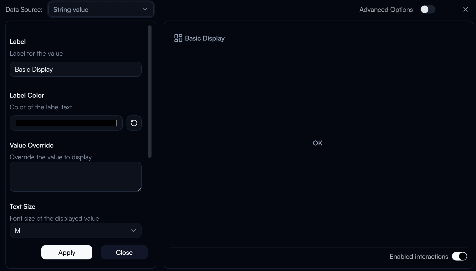
Basic Display settings panel
Label
Label for the displayed value.
Label Color
Color of the label text. Use the color swatch to pick a custom color, or press the reset button (↺) to restore the default.
Value Override
Override the value shown on the widget with a custom value instead of the bound variable's actual value.
Text Size
Font size of the displayed value.
| Value | Description |
|---|---|
S | Small |
M | Medium (default) |
L | Large |
XL | Extra large |
2XL – 9XL | Progressively larger sizes |
Value Conditional Formatting
Applies conditional formatting to the displayed value based on its content. Allows different styles or colors depending on the value.
Replace Empty Value
Controls what is shown when the bound variable has no value.
| Option | Description |
|---|---|
- | Displays a dash |
0 | Displays zero |
N/A | Displays "N/A" |
"" | Displays an empty string |
Advanced Options
Enable Advanced Options at the top right of the settings panel to reveal the following additional settings.
Label Class Name
Tailwind CSS class name applied to the label element for custom styling.
Label Icon ID
The icon to display next to the label.
Label Icon Class Name
Tailwind CSS class name applied to the label icon element for custom styling.
Layout
Display layout of the widget.
| Value | Description |
|---|---|
default | Label appears above the value (stacked vertically) |
row | Label and value appear side by side on the same row |
Value Class Name
Tailwind CSS class name applied to the value element for custom styling.
Vertical Alignment
Vertical alignment of the displayed value within the widget.
| Value | Description |
|---|---|
top | Aligns value to the top |
center | Centers value vertically |
bottom | Aligns value to the bottom |
Horizontal Alignment
Horizontal alignment of the displayed value within the widget.
| Value | Description |
|---|---|
left | Aligns value to the left |
center | Centers value horizontally |
right | Aligns value to the right |
justify | Justifies the value text |
Value Suffix
Text appended after the displayed value, for example a unit or symbol.
Value Suffix Class Name
Tailwind CSS class name applied to the value suffix element for custom styling.