
Week Time Ranges Input
Overview
Week Time Ranges Input is an input widget that provides an interactive weekly schedule editor with draggable time range sliders for each day of the week. Users can add, adjust, or remove time ranges per day, and the result is stored as a structured object in the flow.
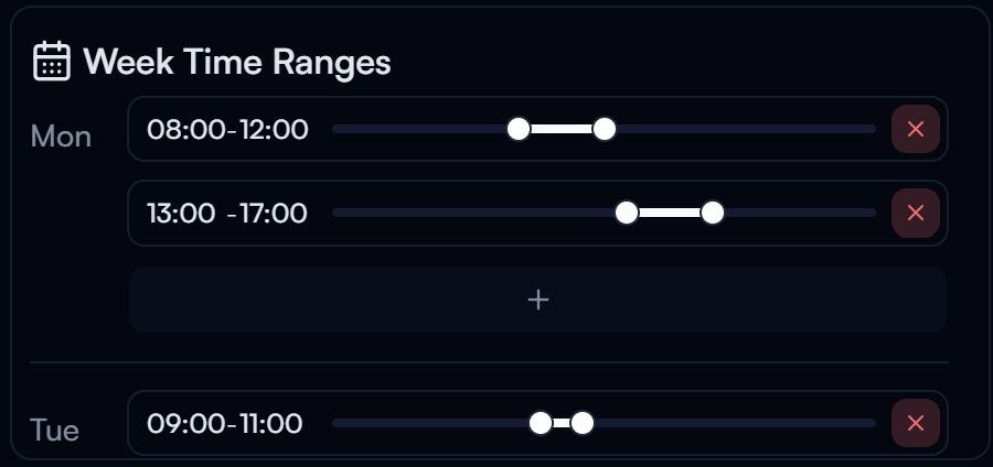
Week Time Ranges Input widget on the Dashboard
Widget Info
| Field | Value |
|---|---|
| Type | Input |
| Description | Interactive weekly schedule editor with draggable ranges |
| Data Types | object{mon,tue,wed,thu,fri,sat,sun: array[array[string]]}, null, undefined |
| Dev Stage | Beta |
Data Source
The Data Source dropdown binds the widget to a flow variable. The configured weekly time ranges are stored as an object with keys for each day of the week (mon, tue, wed, thu, fri, sat, sun), each containing an array of time range pairs.
Settings
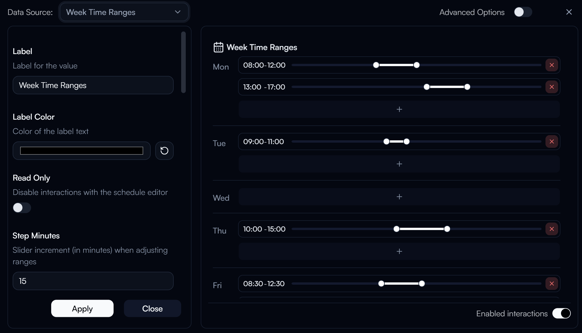
Week Time Ranges Input settings panel
Label
Label displayed on the widget.
Label Color
Color of the label text. Use the color swatch to pick a custom color, or press the reset button (↺) to restore the default.
Read Only
When enabled, disables all interactions with the schedule editor. The current ranges are still displayed but cannot be modified from the dashboard.
Step Minutes
The slider increment in minutes when dragging to adjust time ranges. Defaults to 15.
Min Time
Lower bound in minutes from midnight (0 = 00:00) for the allowed range of each time slot.
Max Time
Upper bound in minutes from midnight (1440 = 24:00) for the allowed range of each time slot.
End of Day as 00:00
When enabled, emits 00:00:00 instead of 24:00:00 for end-of-day values. Useful for satisfying time format validation that does not accept 24:00.
Day Labels
Overrides the label displayed for each day of the week. Each field accepts a custom string to replace the default day abbreviation.
- Monday Label
- Tuesday Label
- Wednesday Label
- Thursday Label
- Friday Label
- Saturday Label
- Sunday Label
Wrapper Class Name
Tailwind CSS classes applied to the outer WeekTimeRanges wrapper element for custom styling.
Advanced Options
Enable Advanced Options at the top right of the settings panel to reveal the following additional settings.
Label Class Name
Tailwind CSS class name applied to the label element for custom styling.
Label Icon ID
The icon to display next to the label.
Label Icon Class Name
Tailwind CSS class name applied to the label icon element for custom styling.
Layout
Display layout of the widget.
| Value | Description |
|---|---|
default | Label appears above the editor (stacked vertically) |
row | Label and editor appear side by side on the same row |