
Trigger Button
Overview
Trigger Button is a trigger widget that fires a trigger signal into the flow when the user clicks the button on the dashboard. It does not bind to a variable — instead it identifies itself with a Trigger ID that the flow listens for. The button supports multiple variants, sizes, icons, and an optional URL to open on click.
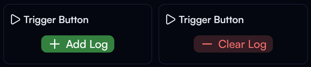
Trigger Button widget on the Dashboard — success and destructive variants
Widget Info
| Field | Value |
|---|---|
| Type | Trigger |
| Description | Button that fires a trigger signal into the flow |
| Data Types | null, undefined |
| Dev Stage | Beta |
Data Source
Trigger Button does not require a data source. The button sends a trigger signal identified by the Trigger Id when clicked.
Settings
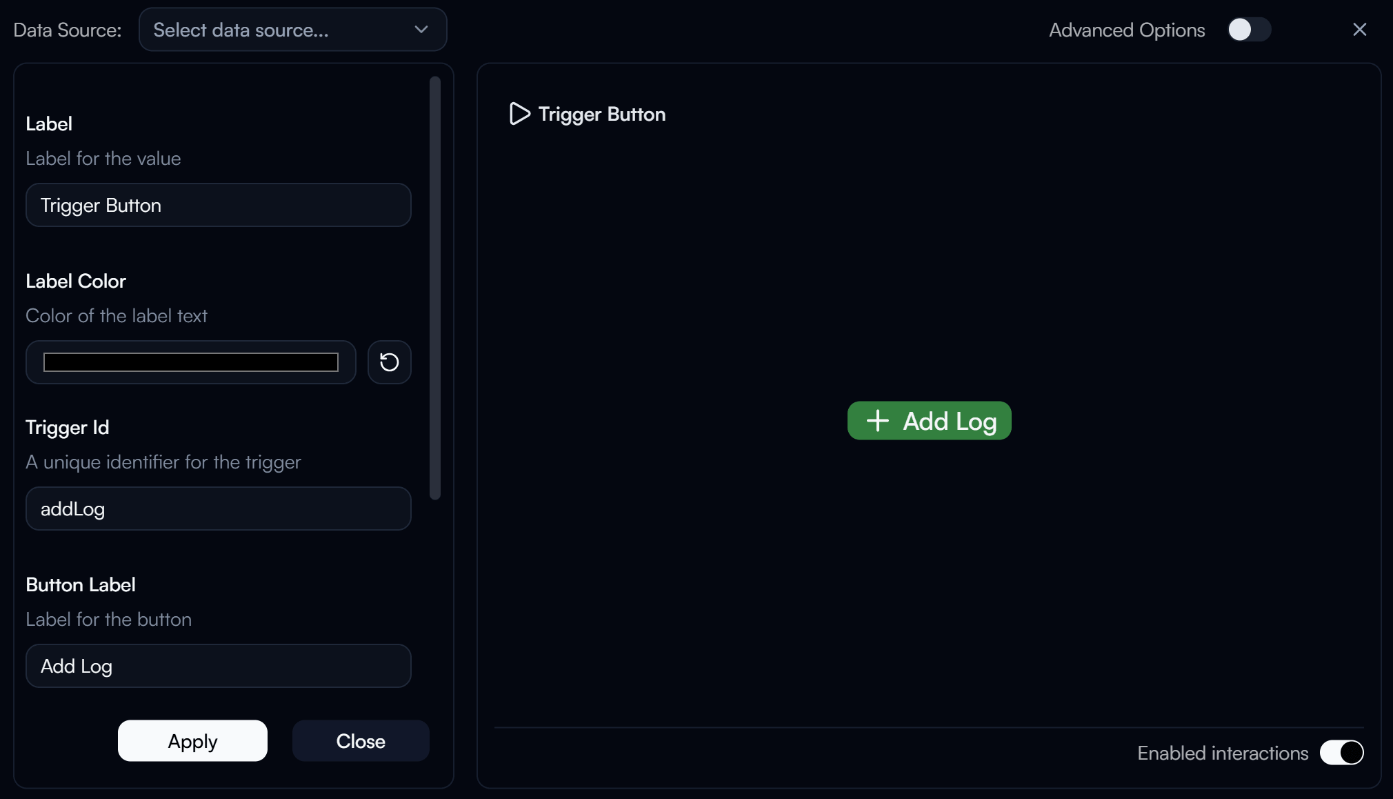
Trigger Button settings panel
Label
Label displayed above the widget.
Label Color
Color of the label text. Use the color swatch to pick a custom color, or press the reset button (↺) to restore the default.
Trigger Id
requiredA unique identifier for this trigger. The flow uses this ID to identify which button was clicked.
Button Label
The text label displayed on the button itself.
Button Size
Controls the size of the button.
Button Variant
Visual style of the button.
| Value | Description |
|---|---|
default | Default button style |
success | Green success style |
destructive | Red destructive style |
outline | Outlined button |
secondary | Secondary style |
ghost | Ghost (transparent) style |
link | Link-like style |
Advanced Options
Enable Advanced Options at the top right of the settings panel to reveal the following additional settings.
Label Class Name
Tailwind CSS class name applied to the label element for custom styling.
Label Icon ID
The icon to display next to the label.
Label Icon Class Name
Tailwind CSS class name applied to the label icon element for custom styling.
Layout
Display layout of the widget.
| Value | Description |
|---|---|
default | Label appears above the button (stacked vertically) |
row | Label and button appear side by side on the same row |
URL
URL to open in the browser when the button is clicked.
Button Class Name
Tailwind CSS class name applied to the button element for custom styling.
Button Label Class Name
Tailwind CSS class name applied to the button label text. When set, this overrides the default Button Size styling.
Button Icon ID
The icon to display inside the button.
Button Icon Class Name
Tailwind CSS class name applied to the button icon element for custom styling.